The different logo types & why your brand needs them
Logos are a very important part of your branding as they stand for what your company does, your values & your business goals. They should speak to your ideal clients and above all, they need to be memorable. There are different types of logos, and your logo suite needs to consist of multiple variations that compliment each other in a way that makes sense and in a way that makes you memorable. We have listed the most common types of logos below:
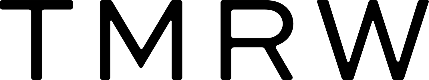
1. Primary Logo (AKA Main Logo)
Your primary logo is the one that use most widely. Usually your primary logo is the foundation on which all of your other logos are based. Generally, it contains an illustration, wording, icons, and sometimes even location information: All of these working together to start forming a cohesive brand identity.
Primary logo designs are mostly used for identifying your brand and establishing brand recognition
They can take up a lot of space given that they contain so many different types of information. This is why they are best suited to use in:
Website headers, branded documents, large printed media

Primary Logo for Nature’s Way, a sustainable beauty brand.
The Primary Logo is normally the largest of the logos in a brand’s logo suite and contains the most information.
2. Secondary Logos
As mentioned above, your primary logo can end up being quite large… this is why the secondary logo exists: it’s serves the purpose of being a brand identifier but it is often easier to read at any size. This is why companies lean towards using their secondary logos more than their primary logos.
The secondary logo is more compact than primary logos, this can save you valuable space on your brand collateral. Generally, secondary logos are used in places where readability is vital, for example:
Mobile website headers, small to average prints and platforms, business cards, email signatures
All of these examples are physically small, so the logo you choose needs to be effective and identifiable at such a small size.

Secondary Logo for Nature’s Way, a sustainable beauty brand.
Secondary Logos need to be memorable and are often used on business cards as a simplified or stacked version of the primary logo.
3. Submarks
The easiest way to describe submarks or brand marks is “miniature versions of primary logos”. Saying that, I don’t mean that they are just shrunken primary logos - that would be terrible for readability! What I mean is that they are simplified elements taken from your primary logo, whether that may be a name, icon or illustration.
Submarks are often seen on social media, this is why they need to be easily recognisable as they are seen by so many people! So, your submarks need to be simple but detailed - ultimately, they need to stand out, especially because they are so small! Submark logos are found in:
Stickers, website footers, small prints and platforms, social media profiles, internal document footers, presentations.

Submark for Nature’s Way
These are often used on social media and print collateral!
4. Wordmarks
Above all else, the one takeaway from a logo is being remembered. Not only the illustration or the slogan - but your name. It’s what makes you unique (in the business world - as others might have the same offers as you). Your name is what your clients and customers primarily use to distinguish between you and your competitors. The association between YOU and YOUR PRODUCTS/SERVICES is important! Achieving a high level of memorability starts, ultimately, with your clients recalling your name. This is what makes wordmarks so essential! They link your services and products to a name and a face that a customer can make a connection with.
Standing alone, wordmarks are all about your choice of name and typography. No distractions. So this is where brand strategy and brand design come in because, yes, subconsciously someone might avoid buying from you because they don’t like the font you chose! You need to make sure that your font choice is easy to read, unique, distinctive and in line with your branding.
Your take-aways about wordmarks should be: make it memorable, make it beautiful and make it versatile. Wordmark logos are best used on:
Products, product labels, online signs, print media

Word Mark for Nature’s Way
Wordmarks need to be simple, memorable and versatile.
5. Brand Icons
Brand Icons are not mandatory but they can come in handy! Have a look up at your browser tabs (If you're on a desktop). Those little pictures differentiating the websites on all of your open tabs are called favicons. Now, just by looking at your tabs, you can tell which one is Google and which one is Facebook - because of that little favicon. This is where your brand icon comes in useful! It adds to your memorability and uniqueness.
If your brand doesn’t have a brand icon - don’t fret! You can get away with using your brand initial. Take facebook for example, they get away with just using their famous blue ‘F’.
Icon logos are best used on:
Favicons, brand Collateral, branded merchandise, giveaways, stickers, product packaging

Favicon for Nature’s Way
Favicon’s appear on your tabs in your browser!
The Impact Of Logo Variations
We’d love to know how versatile your brand is! How many of these logo types do you have in your arsenal? Now remember, it’s not mandatory to have them all… but if you do (and if you use them correctly, strategically and intentionally) then your brand personality and authenticity are sure to stand out! Not to mention that little spark of pride that business owners get when they see their little favicon in action on their websites - come on, it doesn’t get better than that!
Your products and services aren’t made for everyone. That’s not how sales works. You have an ideal client and you cater to that specific client - let your logo’s do the same. You shouldn’t use the same logo on Every. Single. Piece. Of. Brand. Collateral. There are variations for a reason! Each with their own specific purpose and optimal usage. You need to show your audience that you’ve taken this into account. That you value the importance of being seen and being remembered.
If you feel like your logo/s are in need of a touch-up or you feel like your arsenal of logos isn’t as fighting-strong as you’d like it to be- then let’s work together to get you a full logo suite that will get you REMEMBERED.